Ryu Woman
Ryu Woman
Ryu Woman
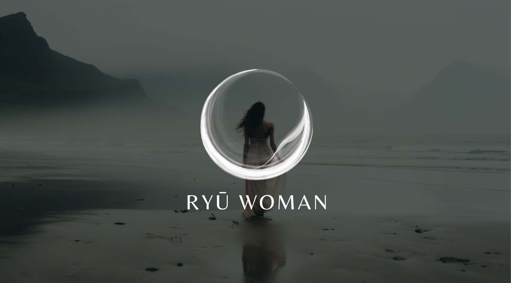
Ryu Woman is dedicated to crafting sacred blends of natural oils with healing properties, created to inspire, nurture, and empower women on their personal journeys. The project’s focus was to develop a visual identity that reflects the brand’s deep connection to nature, femininity, and inner strength.
Ryu Woman is dedicated to crafting sacred blends of natural oils with healing properties, created to inspire, nurture, and empower women on their personal journeys. The project’s focus was to develop a visual identity that reflects the brand’s deep connection to nature, femininity, and inner strength.
Ryu Woman is dedicated to crafting sacred blends of natural oils with healing properties, created to inspire, nurture, and empower women on their personal journeys. The project’s focus was to develop a visual identity that reflects the brand’s deep connection to nature, femininity, and inner strength.
The logo
The logo
The logo
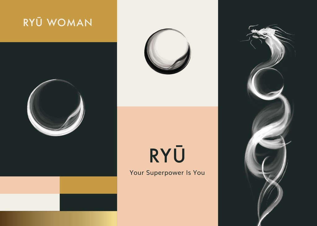
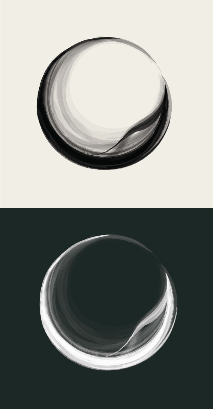
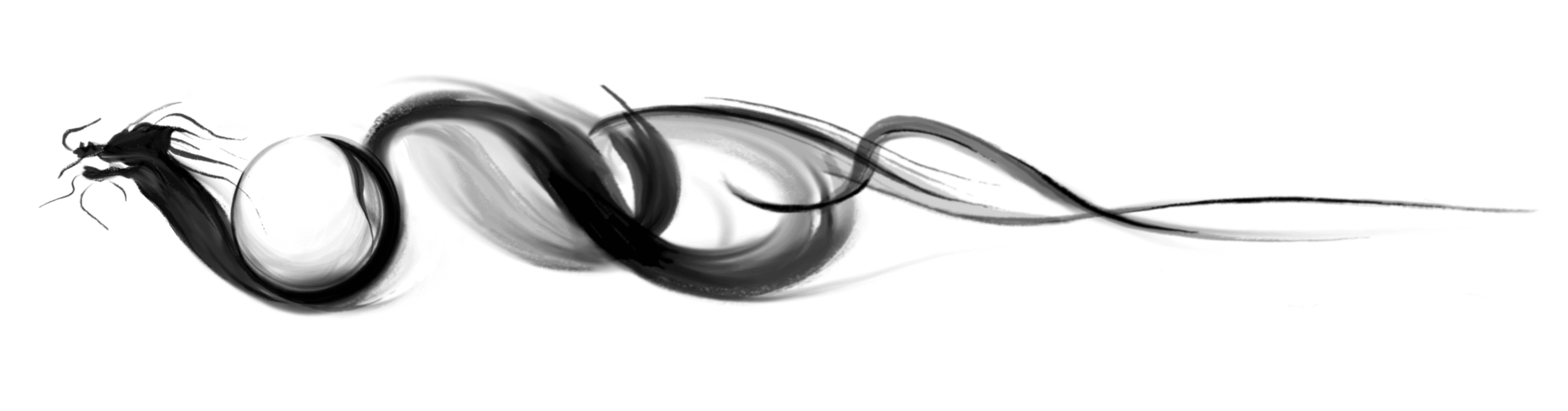
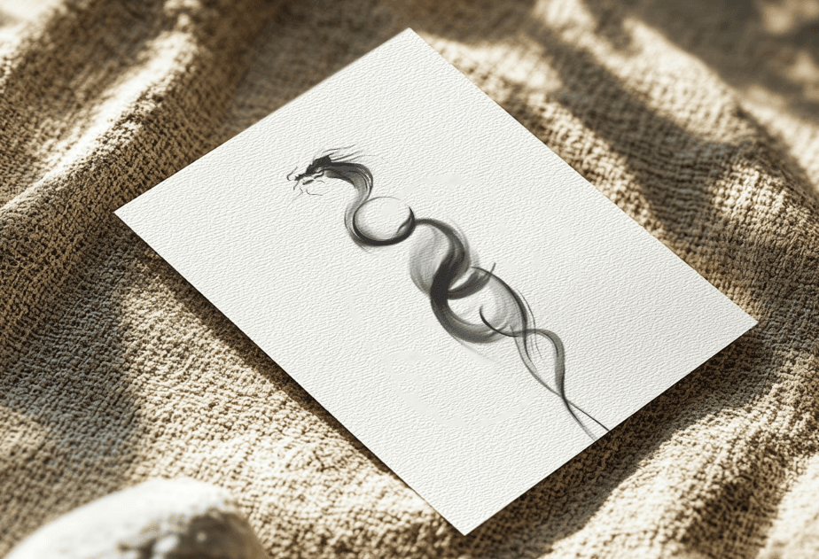
This is an illustrated logo represents the moon and water dragon, drawn into a fluid enso circle that represents transformation. This logo is also made to look like the moon’s reflection on water.
This logo combines hard and soft strokes of the brush that symbolizes strength and boldness as well as mystery and loving soft energy.
The client also requested a custom illustration that represents the energy of the brand, which is a water dragon, with the logo incorporated inside it.
Color palette
Color palette
Color palette
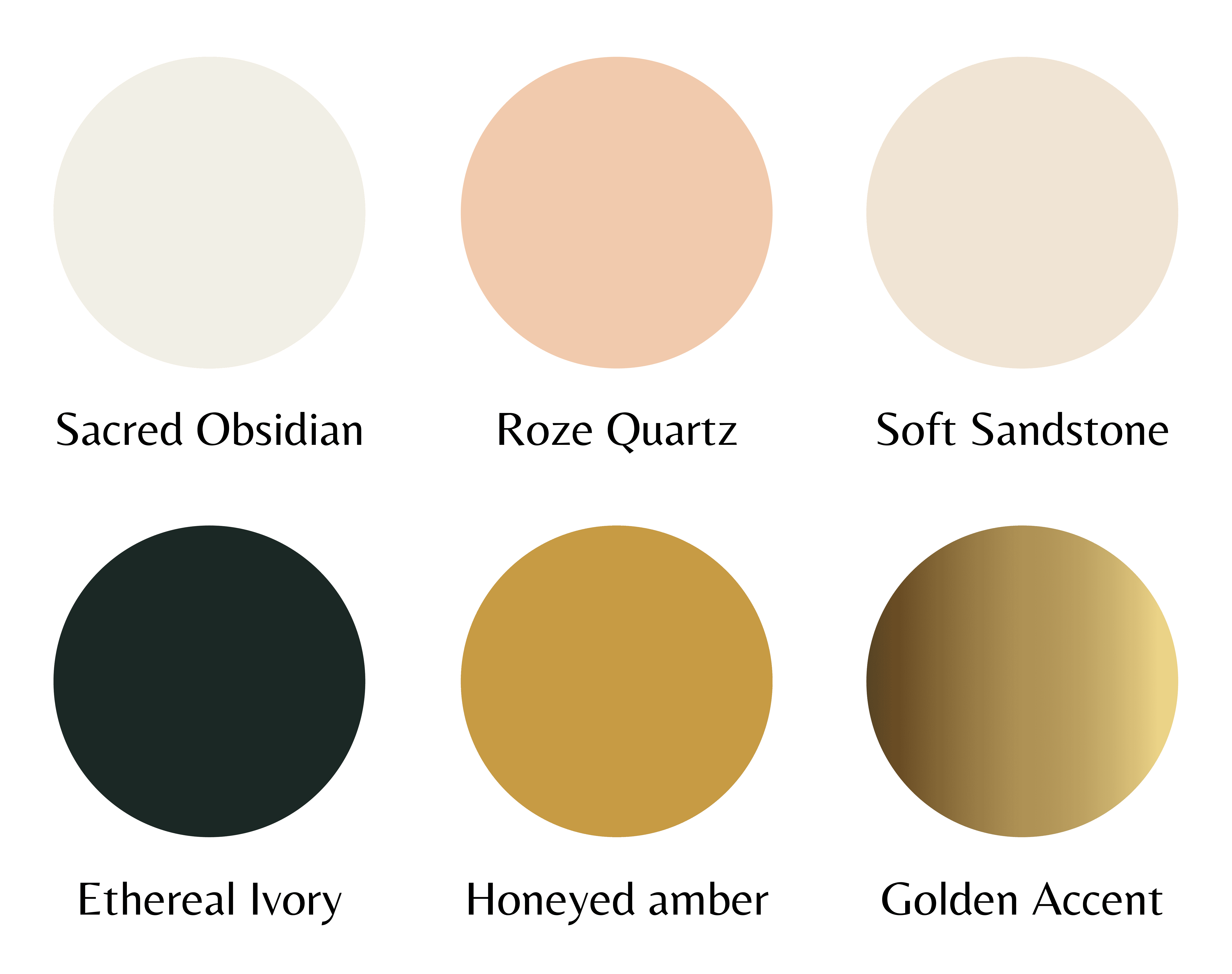
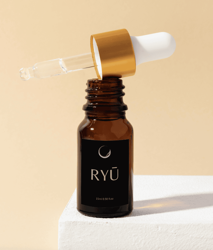
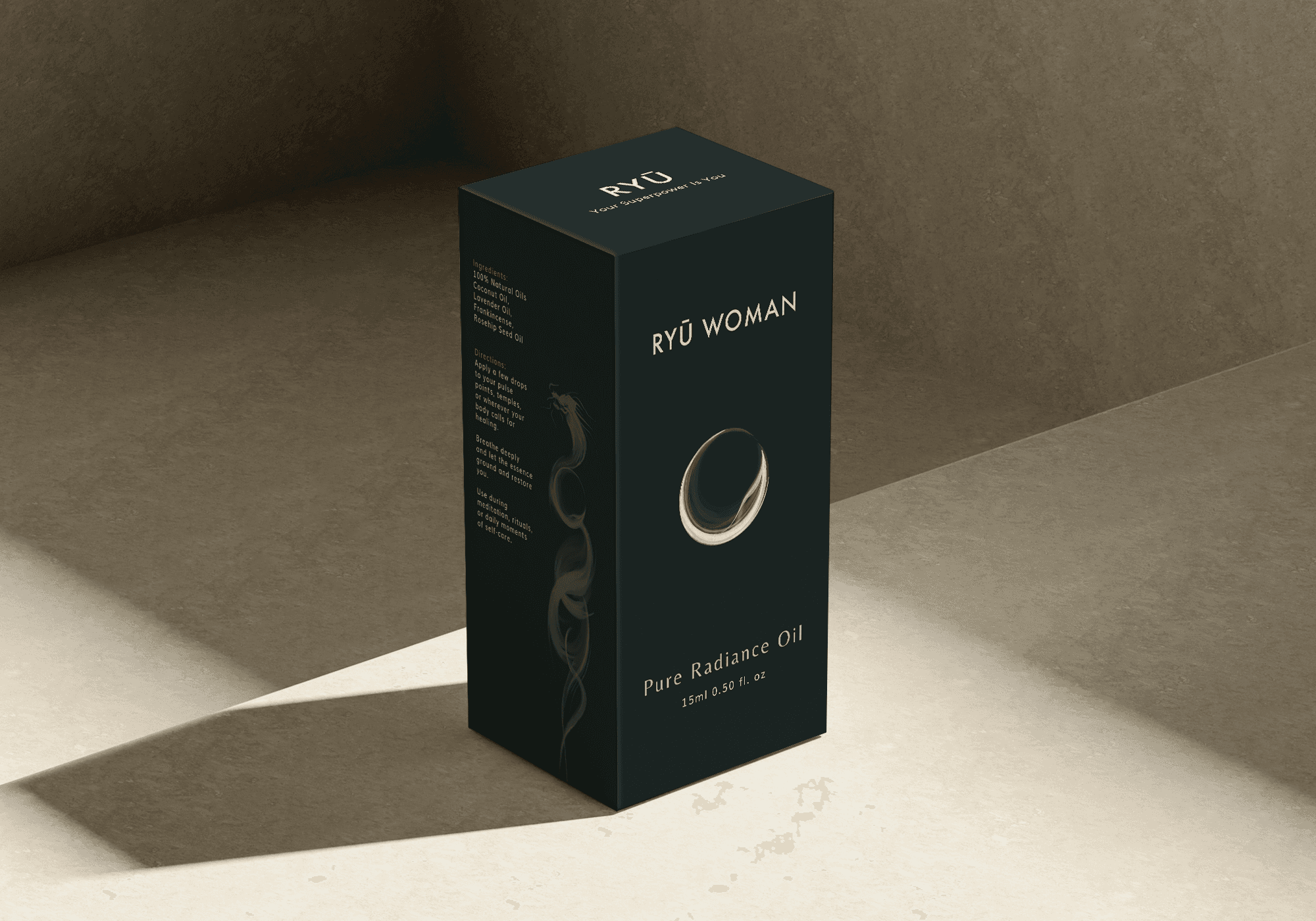
The colors are simple and elegant, but also Sophisticated and radiant. The gold color here represents abundance and well being.
The contrast between dark black and light pink shape represents boldness, passion and mystery in balance with light and softness of the feminine energy
The colors are simple and elegant, but also Sophisticated and radiant. The gold color here represents abundance and well being.
The contrast between dark black and light pink shape represents boldness, passion and mystery in balance with light and softness of the feminine energy
The colors are simple and elegant, but also Sophisticated and radiant. The gold color here represents abundance and well being.
The contrast between dark black and light pink shape represents boldness, passion and mystery in balance with light and softness of the feminine energy
This branding will apply to the product's packaging and social media
This branding will apply to the product's packaging and social media
This branding will apply to the product's packaging and social media
Testimonial
"Gwynne puts her heart into what she does and it’s very evident"
Gwynne produced the final logo, branding, look and feel for one project, and she redesigned the look and feel for a catalog for another. It was a fun process as she’s very open minded, she’s a great listener; and I would say that one of her best traits, is that she doesn’t take feedback personally. She actually uses it to make the project even better.
Gwynne puts her heart into what she does and it’s very evident. I found Gwynne to be easy going, she has a good level of attention to detail, communicates well and delivers on time.
I would highly recommend working with Gwynne.
Sophia Lagonikos
Ryu Woman
Design With Heart
Based: Remote. Always ready to connect.


Design With Heart
Based: Remote.
Always ready to connect.
Design With Heart
Based: Remote. Always ready to connect.